Share this Post
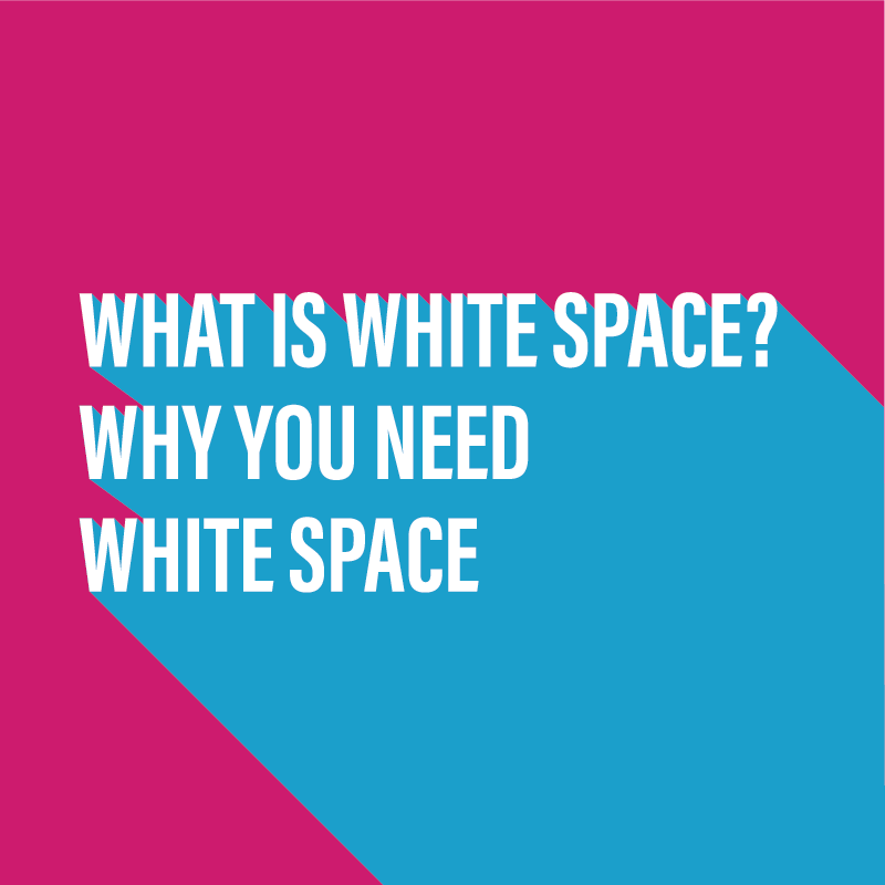
I can hear you asking what is white space, also known as negative space and why should I care?
I'm here to tell you exactly what it is and why you need it in your life, or more specifically, any materials you produce to promote your brand.
White space is vital in making your message clear and easy to read. It gives your layouts structure and purpose. Without it your promotional materials will be a jumbled mess, and nobody wants to be a jumbled mess!
Jump on in to the video and I guarantee that after watching, the insights you get into White Space will change how you look at your marketing materials and that of your competitors and other brands, for the better.
Video Transcript
We all need to breathe to stay alive, right? Our designs and our layouts need to breathe too, to feel alive and look alive. One of the basic techniques that we can use to do that is called White Space. Let's learn about it today.
Hi, everyone. It's Col here from Pixels Ink. Today we're going to talk about white space, which is a very useful technique when you are creating design layouts. It's important that when you're putting together a design layout that you let the elements on the page breathe, and the way that we can do that is by introducing what's known as white space.
Now, this isn't a difficult technique to learn.
It's basically just allowing room around each of the elements, whether that be text, images, or graphics on the page. Just allow enough room around each of those that they can have their own visual focus, that when someone is viewing your layout or your design, that they can get an easy feel for it, and they can take on board whatever it is you're trying to say. Now you can treat white space almost as silence on a page. There's no graphics, there's no text, there's no images. It's empty space.
I've put together some very quick examples to give you an idea of what I mean when I'm talking about white space. If you look at this example, you can see that, yes, we've got a title, and we've got some text, and we've got an image, and we've got a logo, but where does your eye go? You've got ... Everything's just there. There's no path. You just kind of ... Your eye is jumping around from side to side, top to bottom, trying to see, "Well, what's the most important thing here? What are they trying to tell me?" If we now take all of that content which is on that full page, and move to our next example, what we'll see is an example where we've got a clear headline at the top. We've got a sub-headline. We've got our image bottom right, and we've got our logo bottom left.
In between those elements we have empty space or white space. You've got a clear message on the page. You've got a hierarchy. You've got your headline and your sub-headline for the viewer to read, which then leads down to the image, which is bottom right, and then your eye scans across to the left, where you've got the company's logo. White space is helping you do that. It's helping lead the eye around the page, and it's letting the page breathe. If we sit that page and the previous page side by side, I think it's clear to show that white space is important. Now we use the term white space, but that doesn't mean the space has to be white.
In this next example, you can see here that the page is 95% black. We've got a white headline, we've got a white sub-line, and again, we've got another photograph bottom right, and the white space in this case, is just empty blackness, which just again, works really well. It highlights that headline at the top, and then leads your eye down to the figure on the chair bottom right. We may use the term white space, but it doesn't necessarily mean that the space has to be white. You just take white space to mean empty space, where there's no graphics, no text, and no images. That's what white space is. I hope you've enjoyed this video. I've got a lot more videos to come up. If you'd like to be notified when they happen, hit the Subscribe button on my YouTube Channel. Please share with your friends, share with your colleagues if you think they'll find this useful, and hit the Like button, and I'll catch you next time. Thanks for watching.
In Summary
As you can see, utilising white space is not only crucial to allowing the elements on your page to breathe. It is also there to guide someone around the page and can give hierarchy and structure to an otherwise jumbled up page of information.
If you've enjoyed this video, please SUBSCRIBE to my YouTube channel and I'd be grateful for a wee like on the video page.
If you have the time, a comment too on what you liked about the video and how it may have helped you would be brilliant. Comments keep me motivated and guide me as to what to do for future videos and blog posts 🙂