Share this Post
You’ve got this great idea for a new piece of marketing. You’ve pulled together the images, the layout is great, and then you need to choose a font. This is where a lot of people ruin all their hard work through a poor choice of font.
The right font choice can make your marketing piece epic, or, make it look like a dog turd. In the same way that colour and imagery affect emotion in your design, fonts and typography can too.
I’m going to teach you how to make the correct font choice for your project. As a professional graphic designer and a font geek, you'll learn from my years of working with fonts.
To keep everything as simple and as clear as possible, I’m going to break this piece down into 3 sections:
- System / Bundled Fonts
- Free Fonts
- Commercial (Paid For) Fonts
System / Bundled Fonts
These are the easiest fonts to use because they are already on your device. They come pre-installed with the operating system or software applications you have installed.
System fonts, limited in their variety, don’t give much scope for design use. Fonts like Arial, Times New Roman, Calibri, Myriad are professional looking fonts, but dull. One font that stands out though from the others, and is a running joke among most designers is Comic Sans. EURGH!
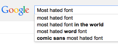
I understand why people use Comic Sans, it is because it is different to the majority of other system fonts. That does not mean though that you should use it for signs, legal notices and annual reports. Yes, I have seen it used in these situations.
Fonts, like people, have character (pun intended). They can be strong, serious, comedic, scary, fun, and much more. Using the wrong font can completely change the message that you are trying to convey to the viewer. Because one font looks very different, does not make that one the correct choice.
Fonts bundled with software applications on your computer expand your font library. This is great as it gives you more scope for your materials.
A word of advice, bundled fonts and system fonts are not free even though you may think they are. The fees for these fonts come included in the price of the software. It pays to look at the licensing agreements for these fonts. This is because it may very well be that you can utilise the fonts included with the software. BUT, only for as long as that software is on your device.
ADVANTAGES:
• Already on your system
• High quality
DISADVANTAGES:
• Limited choice of style
• High usage by other businesses
Free Fonts
If you are on a very tight budget then free fonts are definitely going to be your first port of call. There are thousands of free fonts out there for you to use for your project, all varying degrees of quality.
The first thing to mention is that free doesn’t mean that you can use the font for whatever you want. All fonts come with a license, yes, even free fonts.
When you download a font, it will most likely come with a text file containing the license information for the font which you should most definitely read.
It may be for example that the font is free for personal use only. If you want to use the font for a commercial use then you will need to buy a license.
If you find a free font on a website and it doesn't come with a text file detailing its license agreement. You can try and contact the font creator, and if that is unsuccessful it is best to move on and find another.
It is better to be safe and compliant and not find yourself at the end of a lawsuit further down the line.
A lot of free fonts are created by amateur and hobbyist typography designers. This results in a lot of fonts having poor kerning and only one choice of weight. You may also find the character choice limited too.
You will find a great selection of free fonts over at Google Fonts. There were 1000 different font families at the time of writing this blog. As it is Google, the quality is high on the fonts in their library. I will always tell a client to start here first if they are looking for a free font.
One big problem with free fonts is the high uptake. This can mean a lot of other people using the same font as you for their materials. Don’t let this put you off, though. Using a free font that is well designed and has a good choice of weights is definitely preferable to using basic system fonts.
ADVANTAGES:
• Free
• Huge choice of styles
• Experiment and use for inspiration
DISADVANTAGES:
• Limited choice of weights
• Can be poorly constructed
• High uptake by others / overused
FREE FONT WEBSITES
Google Fonts – One of the best high-quality free font sites out there which keeps on expanding.
Dafont – Huge range of styles but also a high number of poorly constructed fonts. Be sure to select 100% Free from the 'More Options' menu to ensure you are only looking at free to use fonts. See animation below.
Paid Fonts
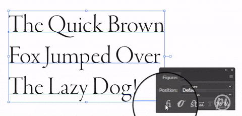
It will come as no surprise to you I’m sure, that paid fonts are of a higher quality compared to free ones. Paid fonts have more time spent developing them compared to free ones. You will generally receive a variety of different font weights and glyphs. This means you will have more character variations to work with and control over the look of your text.
Here you can see the different options available with the font Garamond Premiere Pro.
With paid fonts, it is crucial that you check the license agreement as it may not grant you unlimited use of the font. For example, you may need 2 licenses if you want to use the font in both print and on your website.
A big plus to using a commercial font is that chances are the usage will be lower than if you'd chosen a free font. This will give you more originality in your branding.
ADVANTAGES:
• High quality
• Weights and glyphs
• No copyright issues
DISADVANTAGES:
• License terms can differ
• Can be expensive
COMMERCIAL FONT WEBSITES
MyFonts – One of the largest and most successful paid-for fonts sites. You can buy most fonts for either print or web, or both.
Fontspring – This is a great font site where they have stripped away the legal jargon in the font licenses. They make it very clear what any restrictions are.
The choice is yours
As you can see, there is no right or wrong in using free or paid fonts. You have to choose the option that best fits the purpose you need the font for. If you are creating an important piece of branding, go for something that has a good choice of weights and glyphs. It doesn't matter if it is a free or paid font, as long as it is well constructed.
Over to you...
Do you have a favourite go-to font that you use for your brand, or do you have a recommendation to a great font designer that you think I should be aware of?