Share this Post
Typography mistakes can be costly for your brand. It might seem like one of those simple, easy to do parts of your overall branding, but still, oh so many people get it wrong.
Typography is a powerful tool in your brand communication. When it is done right, it can level up your messaging. So let’s take a look at how you can level up your typography game.
Watch a video version of this blog - BONUS; you’ll hear me singing (badly!)
Suitability and appropriateness of type
One of the areas you need to be aware of when considering
typography, and how this impacts your brand image, is suitability.
I’ve seen lots of branding materials where font use is inappropriate for the type of information being shared or the audience it is being shared to.
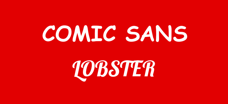
Let’s say you’re going to design the order of service for a funeral, or maybe you’re putting together a CV to apply for a job.
Using fonts from a typeface like Comic Sans or Lobster would be inappropriate for the purpose that they serve. They don’t have the right feeling or tone for serious communication.
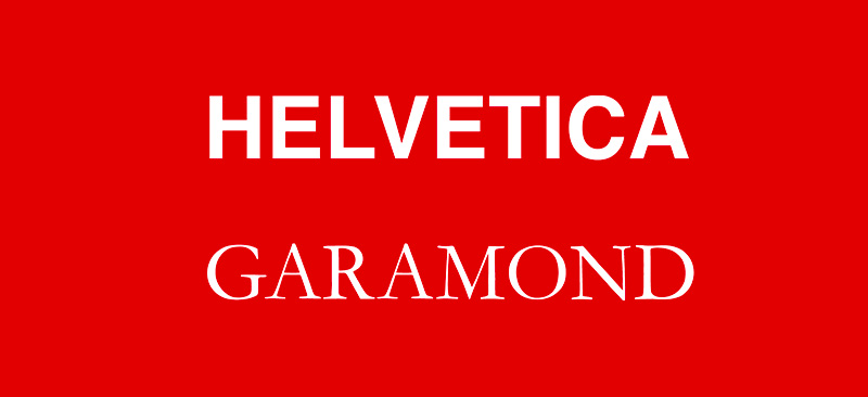
You want to use something like Helvetica or Garamond, which look more professional, and get across the right tone for that particular type of document.
There are, of course, exceptions to the rule. For example, maybe you want your CV to stand out? You are applying for a job at a company where they have a well known, upbeat and wacky culture. In that instance, you'd maybe want to make your CV wacky.
So, before you layout your next piece, think about how you would like the tone of your material to be received and choose the appropriate typeface and font.
Check out the section in this video where I talk about personality of fonts:
Don't choose too many typefaces or fonts.
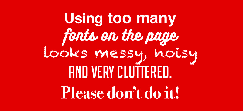
Throwing as many fonts as you have available on your computer/tablet/smartphone into your design will not improve it; it will make it messy, confusing and noisy.
Imagine your design is like a person, trying to speak to someone, where each font is a is spoken in a different voice. Using too many fonts at once is like listening to someone at a loud party or in a nightclub. It is noisy and it is hard to make out what is being said.
If you’ve got lots of different styles on the page; that’s a lot of voices trying to get your attention all at once. If you have too much visual noise from multiple fonts you lose any concept of one clear brand tone or personality.
You want to be speaking in one clear voice.
To do that, limit the number of fonts you have on your page. I’d recommend two, maybe three fonts at most, and using these consistently throughout your piece of work.
Choose a heading font, subheading font and body text font that complement one another. This way, your design will have an even tone throughout.
Throughout this blog you have seen me use the terms typeface and font. They are not the same thing. This video will explain the differences in an easy to remember way.
Choose font pairings that work
As above, when you’ve limited your fonts, it’s essential to think about font pairing and which fonts gel best.
Some work well together when we’re working with fonts, and some don’t; they clash. But don’t forget, you don’t have to work with multiple fonts. Instead, you could work with just one specific typeface and use different font styles from within that typeface.
There are many typefaces out there that have different font styles. For example, the Google typefaces of Raleway and Montserrat have 18 font styles, giving you lots of choices for bold, medium, lightweight, italic, etc.
That means you can have headers, sub-headers, and body copy in the same typeface but using different fonts for differing weights.
If you’d like a little more contrast to your design piece, you want to look at font pairing. Generally, I will take a serif font and a sans serif font that sit nicely together on the page.
If you’re not sure where to start with font pairing and which fonts work well together, I recommend that you check out the sites below.
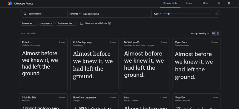
Google Fonts
When you have chosen a typeface, scroll to the bottom of the page. You’ll see a ‘Popular Pairings’ section that tells you which fonts will work well with that particular font you’ve chosen, which is super handy.
https://fonts.google.com
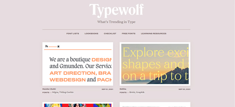
Typewolf
Font pairing is just one of the areas that you will learn on Typewolf. In addition, there are many other resources, like a Typography checklist, to help your designs, covering everything from font size and layout to punctuation.
There are free resources within Typewolf and others you have to pay for, but they are worth it.
https://www.typewolf.com
Use kerning and tracking
Another common mistake in documents is inconsistent kerning and tracking. Kerning is the spacing between individual letters, and tracking is the spacing between letters in an entire word.
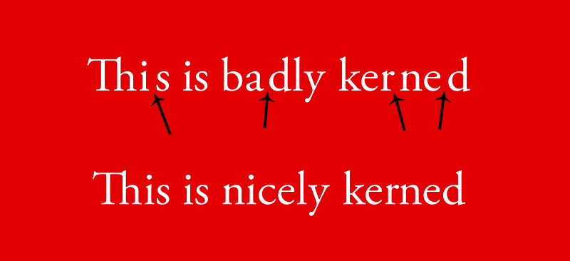
When you select a font and start typing out your text, it may not be perfect. For example, sometimes, the kerning and/or tracking can be off.
If that is the case, you will have to go in and individually adjust the spacing between certain letters to get the correct amount of space between them.
With tracking, it is more of a design choice. For example, you may want a series of words to sit above one another, and you want them all to be the same width in a column.
Watch this video for more detail:
Pay attention to that when you’re looking at your piece of text. Does it look right, or does something look out of place with the spacing?
Whether it’s Microsoft Word, Adobe Photoshop you are using, you can adjust the kerning and tracking, resulting in a more aesthetically pleasing and easier to read piece.
Learn to use hierarchy in your text
With a good understanding of hierarchy, you can make people read the text in the order that you want on the page. That doesn’t have to be top to bottom. It can be middle to bottom to top. So you are creating a more dynamic way of reading your piece of communication.
For example, if you have a special offer, you want your audience to look at that special offer first. So that might be the words sale or special offer or a discount percentage.
Then you want them to look at the offer, and then you can go into more detail after that.
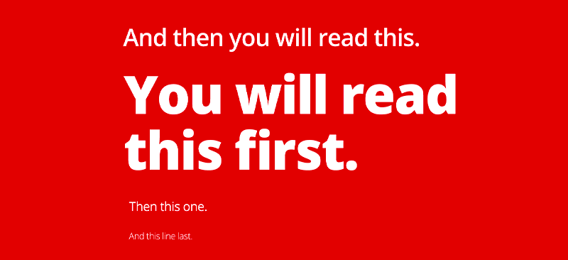
The idea is to use hierarchy to guide the reader’s eye wherever you need it to go on the page. You do this by altering the size, font and layout of the text to establish the order in which you want the information read.
Typography can take quite some time to master. Still, using the above tips will improve things significantly. Use them in your branding materials, presentations or social media content; they will go a long way to improving how your audience perceives your content.
Level up your type with Pixels Ink
There’s a lot covered in this blog, and I understand that you may not have the time to implement these techniques in your branding. if you'd like help to improve your brands typography use I’d be happy to help.
Book a POWER HOUR call with me, and we can look at some of your existing materials and create a plan of action to level your branded content.