Evenbreak - Brand Identity
Rebrand / Brand Strategy / Logo Design / Branding Materials
“It was an amazing use of our time. Col managed to draw out our key values and ethos during his conversations with us.” - Jane Hatton
The following case study gives an insight into our rebranding process for Evenbreak. If you would prefer to watch a video walk-through you can find this at the end of this case study page.
The Backstory
Evenbreak, work with disabled candidates and inclusive employers. They were the first job board of their kind in the UK. They achieved a lot in their first 6 years and made a name for themselves in the niche field they’re in. But it was time to liven up their branding, whilst ensuring this still appealed to their two stakeholders - the candidates and the employers.
Linking In
Jane, the company’s founder, had been happily using the previous branding since 2011 but after employing three new seniors who voiced their feedback that the brand needed a refresh, she decided to explore her options.
It was at this point I was contacted by Evenbreak’s Engagement Manager, Cass, on LinkedIn. It became clear that the company were keen to work with someone who would really get under the skin of the company and deliver this into its new branding.
Fresh Perspectives
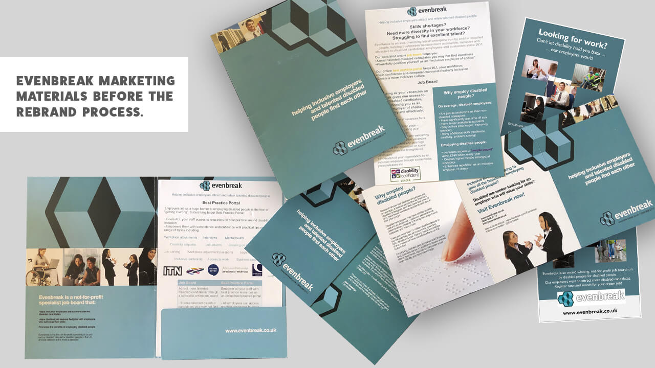
Having been in use since 2011 the previous branding was tired.
The new team members offered a fresh perspective and felt the brand needed bringing up to date to fit in as a modern and forward-thinking business.
Initially there was some resistance from Jane who felt there were other areas of the business that could benefit from a slice of the budget, but in her own words she says; “I was wrong as it turned out!”
As a business owner, Jane tries to justify any decision she makes for the company. Before venturing into the project, she was asking herself if she would think this was a good use of Evenbreak’s time if she was a stakeholder. She initially had a hard time persuading herself that it was necessary in terms of funding, priorities and time.
Jane was under the impression that rebrands were for businesses who were suffering and wanted to shake a previous image. As Evenbreak weren’t struggling, her concern was that they might lose some of what had been gained in their reputation.
She felt like it was starting from scratch and a big voice was saying no.
Eventually Jane was persuaded, not just because she was outnumbered by the team but because she understood that how Evenbreak comes across is very important in terms of messaging.
Cass was quite active on LinkedIn and my name (Col) had come up more than once in different conversations. She did some digging and got some testimonials back about my work which encouraged her to get in touch.
Cass clarified with Jane and her colleagues that they needed to work with someone who would bring out what’s special about Evenbreak and let this shine through in the logo and branding. Without changing what’s special about Evenbreak.
Jane and Cass weren’t looking for a big agency, but someone on a relatively small scale who would be able to deliver personal investment into the project and give it soul.
The process of working with Evenbreak wasn’t as simple as us having a conversation and getting started. They were very selective, and rightly so, about who was going to work with them on the rebrand. I initially spoke with Cass and then with Jane. The team then shortlisted the potential designer down to five people and then to two.
Pixels Ink wasn’t the cheapest option but Evenbreak knew that I understood where they wanted to take the brand and that I’d have an authentic approach. Whilst the company appeals to a corporate market on one hand, they wanted the brand to have a human feel to it.
The challenge involved in working with Evenbreak was that, one brand needed to appeal to two different stakeholders. On one side they work with corporate companies and needed to appear safe and not too quirky.
The flipside is the candidates, individuals who happen to be disabled and are more than likely looking for a corporate role but in an approachable and friendly environment. Ultimately one brand needed to simultaneously appeal to two different types of audiences.
Once it was decided I was the man for the job, we organised a brand strategy workshop to get the team together and generate ideas around the direction of the new brand.
We met up and it was immediately clear that there wasn’t just one decision maker in this process. The team had very strong opinions and were used to over-coming adversity, which meant for a lot of in-depth discussions about the direction of the new brand.
The company website was already in the process of being updated as it needed to be optimised for mobile use. As this process had started before any thought of rebranding Evenbreak, this did place some restrictions on how the site would look and feel in terms of its branding.
A Brand Owned By All
For Jane, team involvement was crucial. After being persuaded to rebrand she felt that their involvement would give more value to the process. She didn’t want the new team members to feel that they were inheriting a brand that they weren’t completely comfortable with representing.
Jane wanted everyone to feel they had ownership. If she’d worked 1-1 with me on the rebrand and come back and the team still couldn’t get behind it, then they’d be back to square one. Team input was the key to achieving the results they were looking for. The priority throughout the process was that everyone felt they had an influence.
When they were looking for a designer, it wasn’t just about logos and colours but also about solid messaging. Before we began the process, all messaging was from Jane. So, with a growing team, it was more important than ever that Evenbreak had brand values and used language that reflected the brand fully, incorporating their tone across the board.
I felt like the brand had a corporate feel which was missing the mark and not fully representing their candidates. As equally important stakeholders, my aim was to strike the ‘impossible’ balance to appeal to both audiences.
Levels and Layers
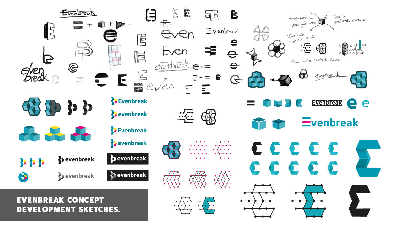
Our branding workshop was a full-on day with the team of six and was also the first time that they’d all met each other at the same time. I had my work cut out, I went in with an agenda and a workshop structure, but the team were very vocal, so it worked out best to take a step back, listen and observe.
Despite the day not going quite to plan, it’s fair to say the outcome was better than any of us expected it to be. By listening to them talk and bounce ideas off one another, I extracted Evenbreak’s ethos, values and what they wanted to achieve. The day was about planting seeds, so even when the session was over, the team were busy digesting the mass of ideas we’d floated about.
After reflecting on the branding workshop, Cass had taken away that their tag line needed to be punchier and more direct. The shorter the better. It was long winded before but the two-word tag line she came up with has much more impact, getting across the same message in less words.
Without the workshop the process would have been much more difficult. We managed to discover what matters most to the team and clarify what was at the core of Evenbreak.
Clarifying the Core
From the branding workshop there was still a lot of ideas following the day, which on reflection helped creative juices flow. This gave us a new way of thinking about what was most important to us.
I knew that Jane was worried that a rebrand would put off their corporate audience as they liked the previous brand. The thought of bright colours was a scary one for her, fearing this would cheapen the brand and be off putting for their audiences. I took this on board and injected small flashes of colour that showed the team how you can embrace a bit of colour whilst maintaining a sophisticated image. The result added to the high end feel of the brand rather than detracted from it.
On the Same Page
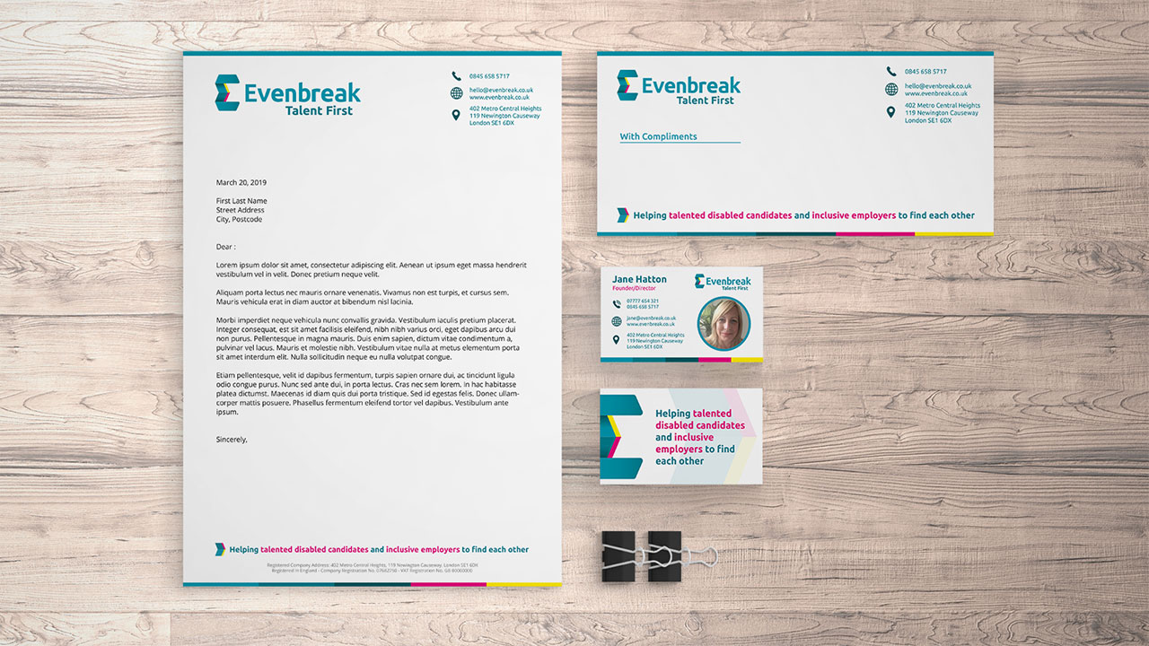
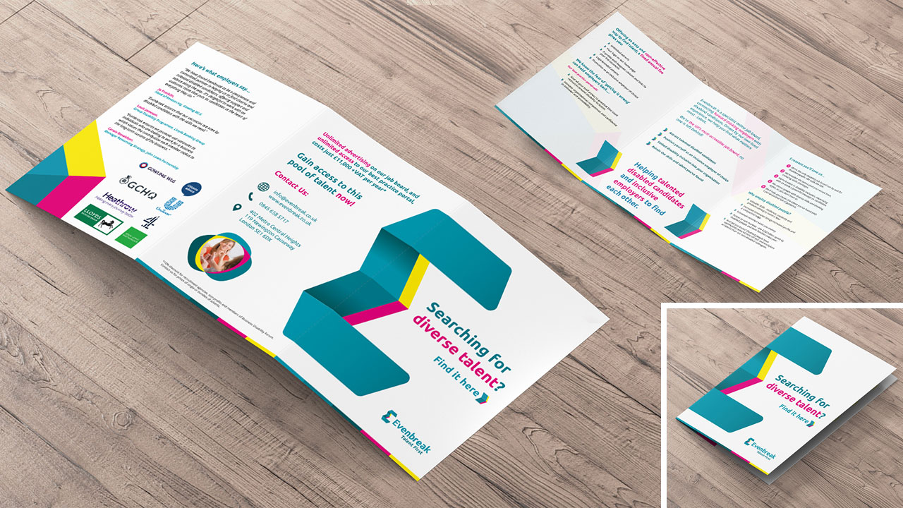
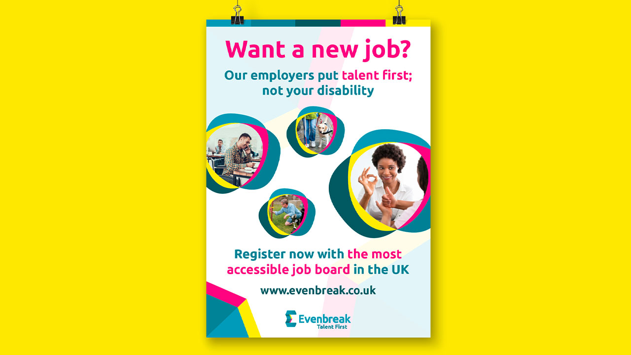
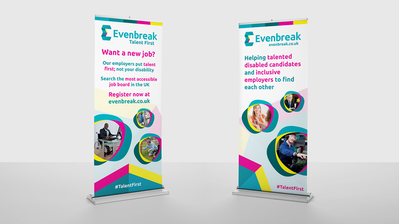
The new brand is versatile and usable for the whole team. I’ve used this across posters, flyers, the company brochure, business cards and letterhead, in both print and digital versions. The team also now have a new PowerPoint template using their branding.
The new branding hasn’t changed the way in which Evenbreak represent themselves to candidates or employers, but it has helped the team to make sure they’re all on the same page. They’re in the planning stages of what is going to happen in future but now have the foundation for this to be built on, with a consistent brand behind them.
Cass excitedly let me know how many people have commented on their new business cards, even if she doesn’t like having her photo taken usually! They’ve had a great impact and the headshot on the card acts as a little memory jogger after networking so people can put a face to a name.
Just like most social enterprises, Evenbreak is a little different to other small businesses. There’s a big emotional attachment and I do get the impression how much more personal it is, it’s not just a job it’s part of their identity.
The team have said the process really made them think about their values as individuals and bringing their experiences into this, outside of the work environment. The branding workshop seems to have had a massive impact on the team. They told me this was one of the first times they’d all met other people with challenges and an openness when discussing impairments or disability.
Solidifying the Team
This opened up the conversation and helped to solidify them as a team, taking a lot of value from the session as an opportunity to bond together in person. So, as well as going away with a new brand this had an even more valuable impact on the company by bringing the team together.
It’s a little too early to measure whether the traffic to their website has increased as a result of the new branding but the difference that Jane mentioned was most notable was in terms of the team and their confidence in representing the brand, which wasn’t there before. They’ve now got confidence in their message and are genuinely behind it now.
Evenbreak now has a lot more life in it, which is exactly how the team described Jane. They didn’t think the original, dull branding reflected her or the company but that’s all changed now!
In Jane's Words
"I felt confident that Col could help us find a way forward in terms of messaging and tone as well as colours and logos. It was an amazing use of our time, my fears were groundless and I am happy to be proved wrong as I feel Evenbreak has really benefited from it. We found that seemingly impossible balance that appeals to both our audiences. Which is remarkable. It was a mark of Col’s incredible abilities that he managed to draw out our key values and ethos during his conversations with us."