Share this Post
You are ready to get the perfect logo designed for your business. But how do you know that you’ll get something great? I mean, you’re about to invest a significant amount of time and money, so you definitely want it to be awesome.
I’ve designed hundreds of logos over the years as a brand designer. From my experience, there are 4 criteria that make for a great business logo design.
Let’s take a dive into each one of them.
Your logo should be original
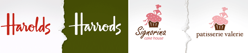
For your logo to stand out from those of your competitors it needs to be original. Don’t get caught up in thinking that your logo needs to say what your business does. Think of all the logos out there that use generic symbols like globes for travel, arrows for delivery and so on. These all merge into one big blur of sameness.
What you need is your logo to be different from everyone else’s. Don’t be tempted to imitate the logo of a competing business because you can see they are crushing it with their branding. They will no doubt have developed a strong brand, it won’t be the logo alone which is making them successful. Their brand will be a combination of many factors all working well together. Copying the look and style of someone else’s logo will only be detrimental to your own brand.
Your logo should be appropriate
Your logo needs to fit the industry that you are in. It’s no good using a quirky font if you are an accountancy firm. And you really shouldn't use that blood red colour you like if you're a dentist.
Your logo should be reflective of your brand values, as much as it does your products or services. By all means, make your logo stand out from other logos in your industry. It should still have relevance to your industry and work seamlessly with the rest of your brand.

Your logo should be adaptable
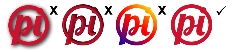
Your logo will appear in many different places such as on a website, a t-shirt, a pen, a vehicle and so on. It should be capable of use on light and dark backgrounds. At small and large sizes and printed onto a variety of materials.
Stay away from drop shadows, bevels, very intricate details and be very careful when it comes to gradients. If your logo has to be viewed at a certain size in or only on light backgrounds for it to make sense, then that is a poorly thought out and executed design.
Your logo should be simple
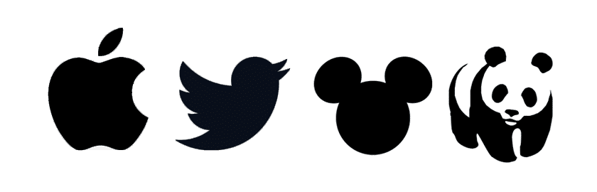
The KISS principle is something to keep in mind when creating a logo design. Following this principle doesn’t mean that your logo has to be boring. Some of the most the world's most famous logos are incredibly simple, but at the same time very clever in their design.
When I’m creating concepts for a logo, I work only in black. By doing it that way, I’m not relying on fancy effects or colours. I’m focusing solely on the shape of the logo. Colour comes in at a later stage of the design process.
Remember these principles of logo design
Original
Appropriate
Adaptable
Simple
These 4 principles aren’t the be all and end all of logo design, but they should be at the very centre of the design process as you create your logo. If whilst working with your designer you keep to them, you can rest assured that your logo will be ready for whatever your marketing requires of it.
If you have a logo design project coming up and you’d like to hire me, then please get in touch.
Related Articles
The KISS Principle (Video)
Using logos on light and dark backgrounds (Video)