Share this Post
You are starting a new business or organisation and one of the things on your to-do list is to create a logo. But which of the 5 logo styles should you use? A wordmark, lettermark, brandmark, combination mark or emblem?
I know what you are thinking. "What if I make the wrong choice! My business will suffer!!"
Will it really?
When it comes to creating a logo for your brand, there is no rule or law that says you should use any specific brand style for a specific business type. You are completely free to choose whichever one you want.
However, in saying that, each one does have benefits that may be more suited to your brand than any of the others.
Today we are going to look at the positives and negatives of each of the 5 main logo styles.
>> Wordmark
>> Lettermark
>> Brandmark
>> Combination Mark
>> Emblem
If you would prefer to watch rather than read, I've also recorded a video version. Click play and put your feet up 😉
Otherwise, read on.
Wordmark (text)
Wordmarks are great for companies who are just starting out, and the reason why is fairly obvious. A wordmark clearly spells out the name of the brand. There is no guesswork involved.
It works even better if your brand name is fairly short and memorable.
One good tip when it comes to creating a wordmark. Don’t use free fonts. Either use a high quality paid font, or something hand drawn.
The reason being that if you use a free font, then there will be thousands of others likely to be using it too. You want your logo to be as unique as possible. So by having something hand drawn, or by choosing a paid for font, you increase the chances of your wordmark logo not looking like someone else’s.
Check out my blog on free fonts versus paid fonts
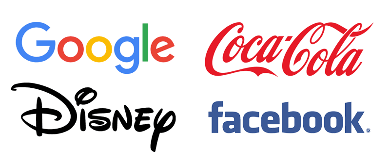
Wordmark examples:
Lettermark (initials)
Lettermarks are great if your brand has a long name, or words that are difficult to pronounce.
By shortening a name down to just the initials, it also gives the logo equal visual weight. So for example if the full name is 2 short words and one long word, by creating a letter mark, you equalise the importance of each one.
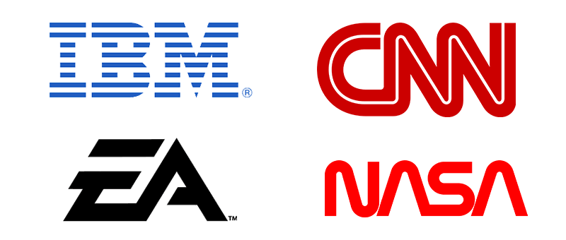
The IBM logo is a good example of this. Their full name is International Business Machines, but their logo, and the way pretty much everyone in the world refers to them is IBM.
Lettermarks are also a good way to save on space. So if you know that your logo is going to appear a lot in small spaces, then this would also make this type of logo a good choice for you.
Lettermark examples:
Brandmark (symbol)
When it comes to expressing an idea without the use of words, a brandmark is a good way to goas it consists of a symbol or an icon.
This is useful for brands which are global, as it can cross language barriers much more easily.
A word of warning though, because you won’t have any words on your logo it makes it very hard for people to find you or know the name of your brand. Especially if your logo is used in isolation of other branding materials.
I would only recommend a brandmark logo to companies that have already established a VERY high level of brand recognition.
If your brand is new to the stage, it is probably best to avoid this logo style.
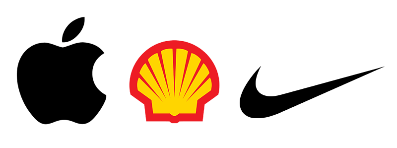
Brandmark examples:
Combination Mark (text + symbol)
The combination mark uses both text and symbols, hence the term ‘combination’.
This style of logo is often the most popular as it is the best of both worlds, using a wordmark and a brandmark together.
Making it much easier for people to see the name of the company and a visual icon to associate with it.
It is important though to get the balance right between the text and the symbol. This means that a combination mark can take much more time to create.
An added benefit is that where certain situations arise, you can split the wordmark and the symbol apart and use them independently. The same still applies though when we talked about using just a symbol before. Unless you have high brand awareness, using a symbol on its own can make brand recognition difficult.
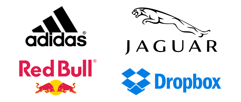
Combination Mark examples:
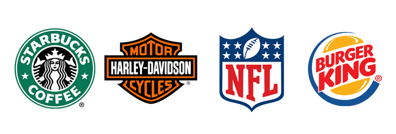
Emblem (text inside symbol)
Emblems are similar to combination marks in that they both use text and symbols. Where a combination mark has the text and symbol next to one another, in the case of an emblem, the text is placed inside the symbol, making it all one shape.
This makes Emblems look more like a badge or a shield.
The benefits to an emblem is that it is compact and as such can fit into restricted spaces on branding materials.
The downside though is that because the text is contained inside of the symbol, you may be limited as to how small your logo can be produced before the text becomes unreadable.
So, if you do decide that you’d like to use an Emblem for your logo, pay careful attention to how much text or small details you include in the design or you can have real legibility issues.
Emblem logo examples:
Summary
As you can see, each of the different logo types has positives and negatives.
There is no real right and wrong choice, only which style will work best for your brand. It is up to you to and your logo designer to discuss and then decide which one that would be.
If you don’t have a logo designer to consult with and need help creating a new logo or refreshing an existing one, then I’m here to help.
You can book one of my Power Hour sessions and we can get you moving forward with your brand and create a logo that is perfect for it.