Share this Post
When you get round to the part where you need to create a new logo fro your business, what colour(s) should you choose?
Well, there isn't really a straight answer. There are many factors that we need to take into account when it comes to colour choice.
Let’s explore some reasons why you may want to blend in with other brands in your industry or stand apart.
Not a big reader? You can watch this video version.
Should your logo colour fit your industry?
Recently, I was asked: "Should your logo colour be the same as others in your industry sector?"
There are pros and cons to choosing the same colours.
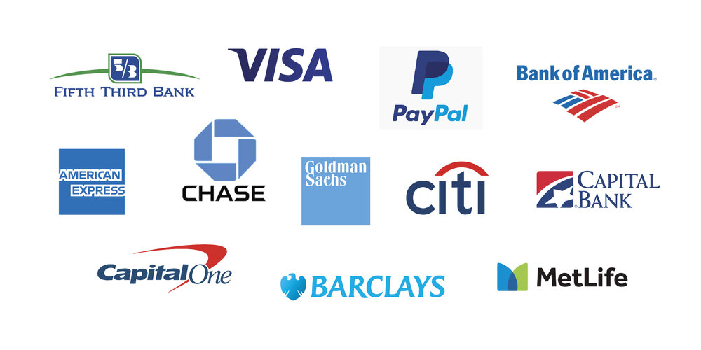
An example of that would be the financial sector, for example, banks, accountants and investment companies.
If you do a Google search, you will find that a lot of their logos have blue elements or are entirely blue. That’s because, in colour psychology, blue is a calm and safe colour, and when it comes to finances, that's what they would want their target customer to feel.
However, if someone came to me who was in the financial sector, I wouldn’t instantly say, “Your logo needs to be blue.”
I would be asking questions such as;
- Who their target audience is?
- Where do they want to go with the business?
- What do they want to achieve?
- What makes them different?
Using your Brand voice to determine your logo colour
Using the questions above (and others) along with additional brand strategy exercises, I work to find out their brand voice and personality. I then use colour psychology techniques to find the colour that best matches their brand.
These exercises and techniques work for any industry sector. Let's take a look at another example.
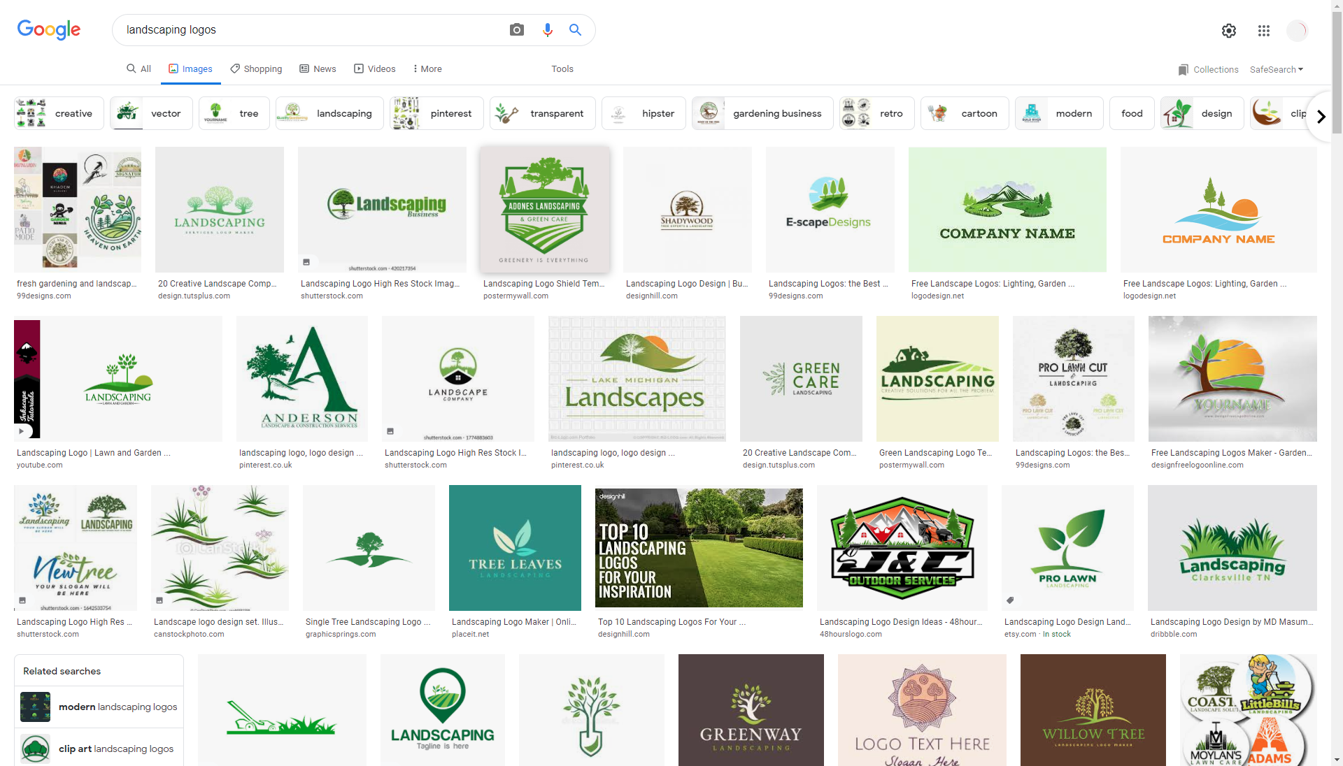
Landscaper/Gardener
If you search on Google for gardening logos, you will see that a majority of them are green. And this is probably what most people think of for landscapers/gardeners.
However, you may want to stand out from the gardening crowd, and so a different colour palette may be the thing that helps you to do that.
To find out what would be the best colours for your brand, you need to study your target customer and determine key demographics and psychographics.
These will change how you approach your branding both in terms of language and visual elements;
- Age groups
- Where they live
- Where they socialise
- Leisure activities
- Family situation, e.g. income, married, kids?
- Personality (serious, humorous, etc.)
- Occupation
These traits all come together with the chosen colour(s) to become part of your brand identity in conjunction with your brand tone of voice.
Spending the time to study your ideal customer will pay dividends. If you skip that part of the brand process, you will be sending out general messaging that probably won't hit the mark.
Using colour psychology
Using a more strategic approach to choosing a colour will help you create a brand identity that makes a more emotional connection to your target customer.
Understanding the psychology of colour will put you at a great advantage when it comes to communicating visually with your audience.
Watch this video for some great insights and direction.
Finding your perfect brand colour(s)
Do you want to develop your brand identity to fit better within your industry? Maybe you want to break boundaries and stand out, but you aren’t sure how to carry out the research. I can help.
Book a Power Hour consultation call, and we can and get the ball rolling on levelling up your brand identity.
We’ll review your existing logo, branding and colours, and by answering a few questions I'll be able to guide you on what the next best course of action should be.
Together we will Rock Your Brand®.